
3.6. Creating new variables/columns#
Sometimes it is helpful to create new variables that transform or recode data in meaningful ways. For example, you may want to:
Categorize a continuous variable - e.g., group people as young / old based off of a continuous age variable
Combine multiple related categories into a single broader group - e.g., merging several diagnosis codes into one “cardiac” category
These kinds of transformations can make your analyses and plots clearer and more interpretable, particularly when communicating results to non-technical audiences. Here we will concentrate on the first example.
3.6.1. Set up Python Libraries#
As usual you will need to run this code block to import the relevant Python libraries
# Set-up Python libraries - you need to run this but you don't need to change it
import numpy as np
import matplotlib.pyplot as plt
import scipy.stats as stats
import pandas as pd
import seaborn as sns
sns.set_theme(style='white')
import statsmodels.api as sm
import statsmodels.formula.api as smf
3.6.2. Import a dataset to work with#
Let’s use the OxfordWeather data:
weather = pd.read_csv("https://raw.githubusercontent.com/jillxoreilly/StatsCourseBook/main/data/OxfordWeather.csv")
display(weather)
| YYYY | MM | DD | Tmax | Tmin | Tmean | Trange | Rainfall_mm | |
|---|---|---|---|---|---|---|---|---|
| 0 | 1827 | 1 | 1 | 8.3 | 5.6 | 7.0 | 2.7 | 0.0 |
| 1 | 1827 | 1 | 2 | 2.2 | 0.0 | 1.1 | 2.2 | 0.0 |
| 2 | 1827 | 1 | 3 | -2.2 | -8.3 | -5.3 | 6.1 | 9.7 |
| 3 | 1827 | 1 | 4 | -1.7 | -7.8 | -4.8 | 6.1 | 0.0 |
| 4 | 1827 | 1 | 5 | 0.0 | -10.6 | -5.3 | 10.6 | 0.0 |
| ... | ... | ... | ... | ... | ... | ... | ... | ... |
| 71338 | 2022 | 4 | 26 | 15.2 | 4.1 | 9.7 | 11.1 | 0.0 |
| 71339 | 2022 | 4 | 27 | 10.7 | 2.6 | 6.7 | 8.1 | 0.0 |
| 71340 | 2022 | 4 | 28 | 12.7 | 3.9 | 8.3 | 8.8 | 0.0 |
| 71341 | 2022 | 4 | 29 | 11.7 | 6.7 | 9.2 | 5.0 | 0.0 |
| 71342 | 2022 | 4 | 30 | 17.6 | 1.0 | 9.3 | 16.6 | 0.0 |
71343 rows × 8 columns
3.6.3. Categorize a continuous variable#
Sometimes we want to analyse or plot a continuous variable in broader categories. For example we might like to plot the weather across the 19th, 20th and 21st centuries separately.
To do this, we first need to create a new column and fill is with a place holder because we don’t yet have any real values to put in it yet. The column name is up to you, here we choose CCCC to conform with the naming convention in the rest of the dataset.
Note: Here we are using None instead of np.nan because we anticipate that we will fill this column with non-numerical data. Nan is very specifically for numeric variables
weather['CCCC'] = None
weather
| YYYY | MM | DD | Tmax | Tmin | Tmean | Trange | Rainfall_mm | CCCC | |
|---|---|---|---|---|---|---|---|---|---|
| 0 | 1827 | 1 | 1 | 8.3 | 5.6 | 7.0 | 2.7 | 0.0 | None |
| 1 | 1827 | 1 | 2 | 2.2 | 0.0 | 1.1 | 2.2 | 0.0 | None |
| 2 | 1827 | 1 | 3 | -2.2 | -8.3 | -5.3 | 6.1 | 9.7 | None |
| 3 | 1827 | 1 | 4 | -1.7 | -7.8 | -4.8 | 6.1 | 0.0 | None |
| 4 | 1827 | 1 | 5 | 0.0 | -10.6 | -5.3 | 10.6 | 0.0 | None |
| ... | ... | ... | ... | ... | ... | ... | ... | ... | ... |
| 71338 | 2022 | 4 | 26 | 15.2 | 4.1 | 9.7 | 11.1 | 0.0 | None |
| 71339 | 2022 | 4 | 27 | 10.7 | 2.6 | 6.7 | 8.1 | 0.0 | None |
| 71340 | 2022 | 4 | 28 | 12.7 | 3.9 | 8.3 | 8.8 | 0.0 | None |
| 71341 | 2022 | 4 | 29 | 11.7 | 6.7 | 9.2 | 5.0 | 0.0 | None |
| 71342 | 2022 | 4 | 30 | 17.6 | 1.0 | 9.3 | 16.6 | 0.0 | None |
71343 rows × 9 columns
Use df.loc[]#
We can use df.loc[] to set the values of CCCC based on the values of YYYY. Remember here the syntax is:
df.loc[rows, cols]
So we will, for example, access the rows where the YYYY is less than 1900 and change the value of CCCC (our new variable) to be 19th.
weather.loc[weather.YYYY<1900, 'CCCC']= "19th"
weather.loc[(weather.YYYY>=1900)&(weather.YYYY<2000), 'CCCC']="20th"
weather.loc[weather.YYYY>2000, 'CCCC']="21st"

weather
| YYYY | MM | DD | Tmax | Tmin | Tmean | Trange | Rainfall_mm | CCCC | |
|---|---|---|---|---|---|---|---|---|---|
| 0 | 1827 | 1 | 1 | 8.3 | 5.6 | 7.0 | 2.7 | 0.0 | 19th |
| 1 | 1827 | 1 | 2 | 2.2 | 0.0 | 1.1 | 2.2 | 0.0 | 19th |
| 2 | 1827 | 1 | 3 | -2.2 | -8.3 | -5.3 | 6.1 | 9.7 | 19th |
| 3 | 1827 | 1 | 4 | -1.7 | -7.8 | -4.8 | 6.1 | 0.0 | 19th |
| 4 | 1827 | 1 | 5 | 0.0 | -10.6 | -5.3 | 10.6 | 0.0 | 19th |
| ... | ... | ... | ... | ... | ... | ... | ... | ... | ... |
| 71338 | 2022 | 4 | 26 | 15.2 | 4.1 | 9.7 | 11.1 | 0.0 | 21st |
| 71339 | 2022 | 4 | 27 | 10.7 | 2.6 | 6.7 | 8.1 | 0.0 | 21st |
| 71340 | 2022 | 4 | 28 | 12.7 | 3.9 | 8.3 | 8.8 | 0.0 | 21st |
| 71341 | 2022 | 4 | 29 | 11.7 | 6.7 | 9.2 | 5.0 | 0.0 | 21st |
| 71342 | 2022 | 4 | 30 | 17.6 | 1.0 | 9.3 | 16.6 | 0.0 | 21st |
71343 rows × 9 columns
Use pd.cut()#
We can also use a handy pandas function, pd.cut() to bin continuous data into discrete categories. The pd.cut() function divides a numeric variable into intervals or bins and can assign a label to those bins.
We’ll reload the data and try using pd.cut() to achieve the same results as above
# reload the dataframe
weather = pd.read_csv("https://raw.githubusercontent.com/jillxoreilly/StatsCourseBook/main/data/OxfordWeather.csv")

weather['CCCC'] = pd.cut(weather.YYYY, bins=[0,1900,2000,9999], labels=['19th','20th','21st'])
weather
| YYYY | MM | DD | Tmax | Tmin | Tmean | Trange | Rainfall_mm | CCCC | |
|---|---|---|---|---|---|---|---|---|---|
| 0 | 1827 | 1 | 1 | 8.3 | 5.6 | 7.0 | 2.7 | 0.0 | 19th |
| 1 | 1827 | 1 | 2 | 2.2 | 0.0 | 1.1 | 2.2 | 0.0 | 19th |
| 2 | 1827 | 1 | 3 | -2.2 | -8.3 | -5.3 | 6.1 | 9.7 | 19th |
| 3 | 1827 | 1 | 4 | -1.7 | -7.8 | -4.8 | 6.1 | 0.0 | 19th |
| 4 | 1827 | 1 | 5 | 0.0 | -10.6 | -5.3 | 10.6 | 0.0 | 19th |
| ... | ... | ... | ... | ... | ... | ... | ... | ... | ... |
| 71338 | 2022 | 4 | 26 | 15.2 | 4.1 | 9.7 | 11.1 | 0.0 | 21st |
| 71339 | 2022 | 4 | 27 | 10.7 | 2.6 | 6.7 | 8.1 | 0.0 | 21st |
| 71340 | 2022 | 4 | 28 | 12.7 | 3.9 | 8.3 | 8.8 | 0.0 | 21st |
| 71341 | 2022 | 4 | 29 | 11.7 | 6.7 | 9.2 | 5.0 | 0.0 | 21st |
| 71342 | 2022 | 4 | 30 | 17.6 | 1.0 | 9.3 | 16.6 | 0.0 | 21st |
71343 rows × 9 columns
This can be handy just to group the data into equal sized bins, as we can also use a set number of bins rather than a list of bin boundaries. To demonstrate this let’s divide the years a bit more evenly with a new variable called Eraand then use sns.countplot() to visualise the difference.
Note: here we are letting pd.cut() automatically determine the labels of our bins, we also could have hard coded this as above, but this is a useful way to know which years belong to each category
weather['Era'] = pd.cut(weather.YYYY, bins=3)

plt.figure(figsize=(10,4))

plt.subplot(1,2,1)
sns.countplot(data= weather, x = 'CCCC', hue = 'CCCC')

plt.subplot(1,2,2)
sns.countplot(data= weather, x = 'Era', hue = 'Era')

plt.tight_layout()
plt.show()
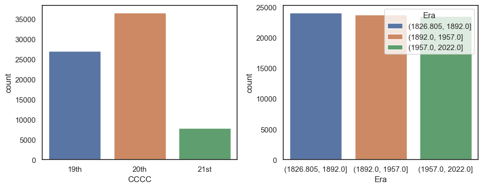
Note on pd.qcut()#
Above each of our bins are approximately the same size (~65 years). Because we have records from each year that means that each bin has approximately the same number of data points. However, this is not always the case. E.g., if the weather was not recorded for several years. With this in mind you could also use the related function pd.qcut() to split the data into quantiles. That means taht each bin will contain roughly the same number of observations. This might be useful is the data are skewed or unevenly distributed