
3.6. Paired Samples t-test#
A paired-samples \(t\)-test tests whether the mean difference between two paired measurements is different from zero.
3.6.1. Set up Python libraries#
As usual, run the code cell below to import the relevant Python libraries
# Set-up Python libraries - you need to run this but you don't need to change it
import numpy as np
import matplotlib.pyplot as plt
import scipy.stats as stats
import pandas as pd
import seaborn as sns
sns.set_theme(style='white')
import statsmodels.api as sm
import statsmodels.formula.api as smf
3.6.2. Example: Horror Movies and Heart Rate#

A scientist hypothesises that watching horror movies raises our heart rate .
She tests this by measuring the heart rate of 20 volunteers under two conditions:
while watching a horror movie;
while watching a cookery show.
Each volunteer takes part in both conditions. For each participant, the researcher records heart rate (beats per minute) in both conditions.
Question: test whether heart rate is higher when watching a horror movie than when watching a cookery show.
Notes:
This is a repeated-measures (paired) design: the same participants are measured in both conditions.
Because measurements are paired, the analysis should be based on the within-participant differences in heart rate.
If the differences are approximately Normally distributed, a paired-samples \(t\)-test is appropriate.
The hypothesis is directional (horror movies increase heart rate), which justifies a one-sided test.
Practical steps
Inspect the data to check for extreme outliers and approximate Normality.
State the formal hypotheses.
Report the descriptive statistics (mean or median difference, and sample size).
Run the paired test.
Draw conclusions.
1. Inspect the data#
Let’s load the data into a Pandas DataFrame and plot them. In this case, it is helpful to visualise the data in more than one way.
Plot a Scatter Plot of heart rate in the two conditions to visualise the effect of interest and the pairing between observations.
Plot a KDE and/or rug plot of the paired differences (horror − cookery) to assess whether the differences are approximately Normally distributed.
# load the data and have a look
heartRates = pd.read_csv('https://raw.githubusercontent.com/jillxoreilly/StatsCourseBook_2024/main/data/HeartRates.csv')
display(heartRates)
| cookery | horror | |
|---|---|---|
| 0 | 60.4 | 72.9 |
| 1 | 53.9 | 57.0 |
| 2 | 54.4 | 68.3 |
| 3 | 60.0 | 57.4 |
| 4 | 67.7 | 58.7 |
| 5 | 56.2 | 47.0 |
| 6 | 61.9 | 71.8 |
| 7 | 58.9 | 62.1 |
| 8 | 65.6 | 68.6 |
| 9 | 54.6 | 73.8 |
| 10 | 85.2 | 93.1 |
| 11 | 87.8 | 94.8 |
| 12 | 90.5 | 111.4 |
| 13 | 92.7 | 89.7 |
| 14 | 85.4 | 97.4 |
| 15 | 77.5 | 90.9 |
| 16 | 81.3 | 83.9 |
| 17 | 79.7 | 86.9 |
| 18 | 96.8 | 90.1 |
| 19 | 81.9 | 75.4 |
Scatterplot
For paired data, one of the most effective ways to get a sense of the data is with a scatter plot. Plotting each participant’s heart rate in one condition against their heart rate in the other condition makes the pairing explicit.
A reference line (e.g. the line \(y = x\)) can be added to help visualise the effect (points above the line indicate higher heart rates in the horror movie condition)
sns.regplot(data = heartRates, x="cookery", y="horror")
plt.xlabel('heart rate: cookery')
plt.ylabel('heart rate: horror')

# add the line x=y (ie a line from point(50,50) to (110,110)) for reference
plt.plot([50,110],[50,110],'r--')
plt.show()
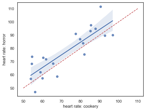
It looks like:
For most individuals, heart rate is higher during the horror movie, as most data points lie above the line \(x = y\). (But we will need to do a statistical test to confirm!)
There is a strong effect of individual differences: people with low heart rates during the cookery show also tend to have low heart rates during the horror movie, which is why the data points are stretched out along the line \(x = y\).
Overall, individual differences in heart rate appear to dwarf the effect of the type of TV show being watched. This highlights the value of using a paired design, in which these individual differences are controlled for by focusing on the within-individual change in heart rate between conditions.
KDE / rug plot: assumption of Normality
In the case of paired data, the key assumption of the \(t\)-test is that the differences between conditions (for each participant) are Normally distributed. To check this, we first add a column to our DataFrame containing the paired differences.
heartRates['diff'] = heartRates.horror - heartRates.cookery
heartRates
| cookery | horror | diff | |
|---|---|---|---|
| 0 | 60.4 | 72.9 | 12.5 |
| 1 | 53.9 | 57.0 | 3.1 |
| 2 | 54.4 | 68.3 | 13.9 |
| 3 | 60.0 | 57.4 | -2.6 |
| 4 | 67.7 | 58.7 | -9.0 |
| 5 | 56.2 | 47.0 | -9.2 |
| 6 | 61.9 | 71.8 | 9.9 |
| 7 | 58.9 | 62.1 | 3.2 |
| 8 | 65.6 | 68.6 | 3.0 |
| 9 | 54.6 | 73.8 | 19.2 |
| 10 | 85.2 | 93.1 | 7.9 |
| 11 | 87.8 | 94.8 | 7.0 |
| 12 | 90.5 | 111.4 | 20.9 |
| 13 | 92.7 | 89.7 | -3.0 |
| 14 | 85.4 | 97.4 | 12.0 |
| 15 | 77.5 | 90.9 | 13.4 |
| 16 | 81.3 | 83.9 | 2.6 |
| 17 | 79.7 | 86.9 | 7.2 |
| 18 | 96.8 | 90.1 | -6.7 |
| 19 | 81.9 | 75.4 | -6.5 |
Now let’s plot the differences to get a sense of whether they are normally distributed.
sns.kdeplot(data = heartRates,  x='diff', fill=True)
sns.rugplot(data = heartRates, x='diff', height=0.1,)
plt.show()
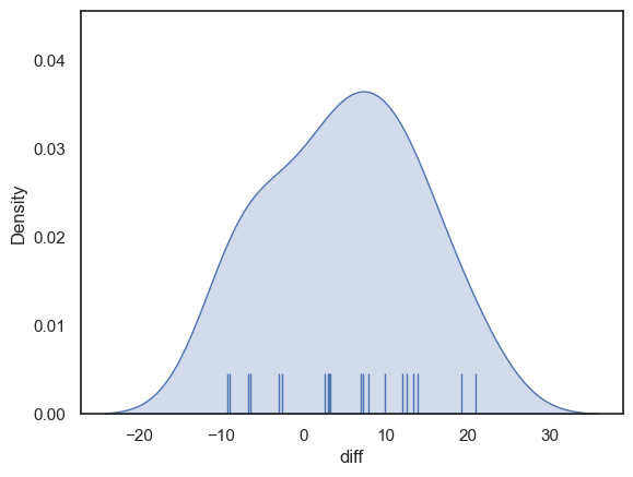
The distribution looks fairly normal - for the sake of this example we can safely go ahead and use the t-test (although in real life I think it is always tricky to know if the data are really normally distributed, especially if the sample is small)
2. Hypotheses#
\(\mathcal{H_o}\): the mean difference in heart rate for an individual watching cookery or horror shows is zero
\(\mathcal{H_a}\): the mean difference in heart rate is positive (higher heart rate for horror)
This is a one tailed test as the researcher’s hypothesis (described above) is directional - she thinks horror movies increase heart rate
We will test at the \(\alpha = 0.05\) significance level
3. Descriptive statistics#
First, we obtain the relevant desriptive statistics. By relevant, I mean the ones that go into the equation for the t-test:
\( t = \frac{\bar{d}}{\frac{s_d}{\sqrt{n}}} \)
This would be the means difference in heart rate for horror-cookery \(\bar{d}\), the standard deviations of the differences \(s_d\) and the number of participants \(n\).
We obtain the descriptive statistics for each column in our dataframe using the describe() method as before:
heartRates.describe()
| cookery | horror | diff | |
|---|---|---|---|
| count | 20.000000 | 20.000000 | 20.000000 |
| mean | 72.620000 | 77.560000 | 4.940000 |
| std | 14.612489 | 16.678047 | 9.049013 |
| min | 53.900000 | 47.000000 | -9.200000 |
| 25% | 59.725000 | 66.750000 | -2.700000 |
| 50% | 72.600000 | 74.600000 | 5.100000 |
| 75% | 85.250000 | 90.300000 | 12.125000 |
| max | 96.800000 | 111.400000 | 20.900000 |
The mean difference in heart rate is 4.94 beats per minute, with heart rate being higher in the horror condition. This is quite a large effect relative to the mean heart rate in each condition (72.6 bpm in the cookery condition and 77.5 bpm in the horror condition), representing an increase of more than 5%. On average, watching the horror movie therefore produces a noticeable increase in heart rate.
Because the mean difference is easier to interpret when we also know the mean heart rate in each condition, it is good practice to report the condition means (cookery and horror), even though these means are not directly used in the paired \(t\)-test.
The standard deviation of the paired differences is 9.04 bpm. This is smaller than the standard deviation within each condition (14.6 bpm for cookery and 16.7 bpm for horror), which reflects the correlation between heart rates in the two conditions, as seen in the scatter plot above.
The sample size is \(n = 20\) participants.
4. Carry out the test#
We carry out the test using the function stats.ttest_rel() from scipy.stats.
The inputs to stats.ttest_rel() are:
the two paired samples to be compared (the
heartRate.horrorandheartRate.cookerycolumns from our Pandas DataFrameheartRates);the argument
alternative='greater', which specifies a one-tailed test in which the mean heart rate in the horror condition is expected to be greater than the mean heart rate in the cookery condition.
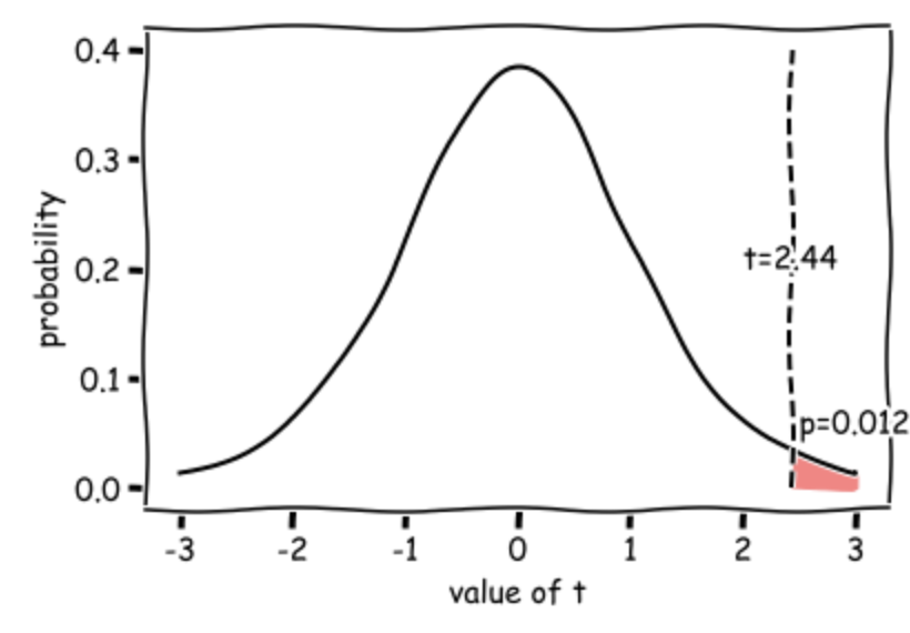
The outputs are the value of the test statistic (\(t = 2.44\)) and the associated p-value (\(p = 0.0122\)). Because this p-value is less than our chosen significance level (\(\alpha = 0.05\)), we conclude that there is a statistically significant difference between the conditions.
stats.ttest_rel(heartRates.horror, heartRates.cookery, alternative='greater')
TtestResult(statistic=np.float64(2.4414101572270717), pvalue=np.float64(0.012293439285066583), df=np.int64(19))
Degrees of freedom
In a scientific write-up we also need to report the degrees of freedom of the test. This tells us how many observations (data-points) the test was based on, corrected for the number of means we had to estimate from the data in order to do the test.
In the case of the paired samples t-test \(df = n-1\) where \(n\) is the number of pairs, so in this case, df=19 and we can report out test results as: \(t(19) = 2.44, p=0.0122\) (one-tailed)
5. Draw conclusions#
Our t value of 2.27 means that the mean increase in heart rate from the cookery to horror conditions is 2.27 times the standard error (where \( SE = \frac{s}{\sqrt{n}}\)).
Such a large difference (in the expected direction) would occur 0.0123 (1.23%) of the time due to chance if the null hypothesis were true (if the TV show made no difference to the heart rate), hence the p value of 0.0123.
This diagram shows the expected distribution of t-values if the null hypothesis was true, with our obtained t-value marked:
3.6.3. Write-up#
Above, I walked you through how to run the t-test and why we make different choices.
In this section we practice writing up our analysis in the correct style for a scientific report.
Replace the XXXs with the correct values!
We tested the hypothesis that heart rate increases when watching a horror show as opposed to a cookery show.
For 20 participants, average heart rate was measured over 30min watching a horror show and, on a separate day, 30min watching a cookery show (repeated measures design). The order of conditions was counterbalanced.
Data are shown below - there appears to be a strong effect of resting heart rate (individuals with high heart rates in one condition have high heart rates in the other condition) and heart rates are generally higher in the horror condition:
sns.regplot(data = heartRates, x="cookery", y="horror")
plt.xlabel('heart rate: cookery')
plt.ylabel('heart rate: horror')

# add the line x=y (ie a line from point(50,50) to (110,110)) for reference
plt.plot([50,110],[50,110],'r--')
plt.show()

Note - the red dashed line is the line of equality \((x=y)\); heart rate is generally higher for each individual in the horror condition (most points lie above teh line \((x=y)\). There is a strong correlation between the two measures of heart rate for each individual, indicating an individual differences in heart rate regardless of condition, which should be controlled by the use of a repeated measures design.
The mean increase in heart rate in the horror condition was X.XX beats per minute (condition means were XX.X bpm for cookery and XX.X for horror). The standard deviation of differences in heart rate was X.XX bpm (condition standard deviations were XX.X bpm for cookery and XX.X for horror).
heartRates = pd.read_csv('https://raw.githubusercontent.com/jillxoreilly/StatsCourseBook_2024/main/data/HeartRates.csv')
heartRates['diff'] = heartRates.horror - heartRates.cookery
heartRates.describe()
| cookery | horror | diff | |
|---|---|---|---|
| count | 20.000000 | 20.000000 | 20.000000 |
| mean | 72.620000 | 77.560000 | 4.940000 |
| std | 14.612489 | 16.678047 | 9.049013 |
| min | 53.900000 | 47.000000 | -9.200000 |
| 25% | 59.725000 | 66.750000 | -2.700000 |
| 50% | 72.600000 | 74.600000 | 5.100000 |
| 75% | 85.250000 | 90.300000 | 12.125000 |
| max | 96.800000 | 111.400000 | 20.900000 |
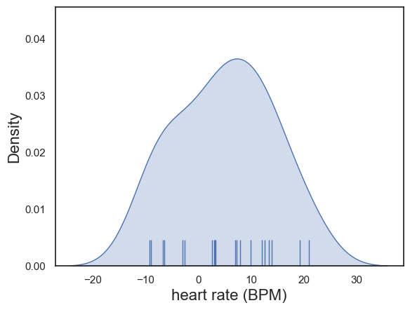
The differences in heart rate were determined by inspection to be approximately normally distrbuted:
plot = sns.kdeplot(data = heartRates,  x='diff', fill=True)
sns.rugplot(data = heartRates, x='diff', height=0.1,)
plot.set_xlabel("heart rate (BPM)", fontsize = 16)
plot.set_ylabel("Density", fontsize = 16)
Text(0, 0.5, 'Density')
An paired samples t-test was therefore used to compare the means (alpha = XXX, XXX-tailed).
stats.ttest_rel(heartRates.horror, heartRates.cookery, alternative='greater')
TtestResult(statistic=np.float64(2.4414101572270717), pvalue=np.float64(0.012293439285066583), df=np.int64(19))
Heart rates were indeed significantly increased in the horror condition: t(19) = X.XX, p=X.XXX.
As p<0.05 we conclude that on average, individuals’ heart rates increase when watching horror shows as opposed to cookery shows.
3.6.4. Further Exercises#
- What do you think would happen if you ran an independent samples t-test on the data - would the p value become more or less significant? Why?
- Change the code to actually run an independent samples test. Was you intuition correct?