3.5. Sample vs population#
As researchers, we aim to discover patterns or relationships that are true in general, that is, for a wider population
For example:
Do taller people earn more?
Do people taking a certain drug have fewer panic attacks?
Do neurons fire faster in the presence of a certain neuromodulator?
To answer questions like these, its rarely possible (or practical) to measure everyone in a population (e.g., we cannot measure the heights and earnings of all workers). Instead we measure a sample of workers/ pateints/ neurons and try to generalize or infer something about the population from this sample. A sample, is a smaller group drawn from the original population of interest.
Understanding the relationship between a sample and the population it comes from is one of the most important ideas in statistics. To help us, we can explore this relationship by taking a large ‘parent’ dataset (similar to the population) and repeatedly drawing samples from it.
3.5.1. Set up Python libraries#
As usual, run the code cell below to import the relevant Python libraries
# Set-up Python libraries - you need to run this but you don't need to change it
import numpy as np
import matplotlib.pyplot as plt
import scipy.stats as stats
import pandas as pd
import seaborn as sns
sns.set_theme(style='white')
import statsmodels.api as sm
import statsmodels.formula.api as smf
import warnings
warnings.simplefilter('ignore', category=FutureWarning)
3.5.2. Load and plot the data#
In this section, we’ll work with a dataset that has a distinctly non-normal distribution. Specifically, looking at scores from a fictional 100-item political questionnaire called BrexDex, completed by UK residents who were adults at the time of Brexit (2016).
The questions are designed and scored so that a high score overall score on the questionnaire indicates an attitude against Brexit, and a low score indicates an attitude in favour of Brexit.
Because the scores relate to a polarizing topic, the data distribution is bimodal. In otherwords, we will find two-peaks - one at the low end and one at the high end of the scale - rather then a bell-shaped curve. This pattern suggests most respondents hold strong opions either for or against Brexit, with relatively few people taking a more neutral position
We’ll use a data file containing scores from 10,000 individuals on the BrexDex questionnaire. This dataset represents our parent population and we will practice simulating the process of sampling from that wider population by drawing repeated samples from these 10,000 data points.
First load the data:
UKBrexdex=pd.read_csv('https://raw.githubusercontent.com/jillxoreilly/StatsCourseBook_2024/main/data/UKBrexdex.csv')
UKBrexdex
| ID_code | score | |
|---|---|---|
| 0 | 186640 | 53 |
| 1 | 588140 | 90 |
| 2 | 977390 | 30 |
| 3 | 948470 | 42 |
| 4 | 564360 | 84 |
| ... | ... | ... |
| 9995 | 851780 | 81 |
| 9996 | 698340 | 45 |
| 9997 | 693580 | 51 |
| 9998 | 872730 | 78 |
| 9999 | 385642 | 88 |
10000 rows × 2 columns
We can see that the dataset contains 10,000 individuals’ scores on the BrexDex questionnaire.
Let’s plot them to get a sense of the distribution:
sns.histplot(UKBrexdex.score, bins=range(101))
plt.xlabel('score on BrexDex')
plt.ylabel('frequency')
plt.show()
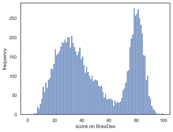
The dataset (10,000 responses) is large enough that we can assume the distribution is fairly representative of the populationa as a whole.
Now let’s think about what kind of distribution we might expect to see if we take a sample of 100 people from this population
3.5.3. The sample distribution resembles the parent distribution#
Let’s find out by drawing a random sample of \(n=100\) from our original dataset.
We can do this using the tool df.sample() which makes a random selection of datapoints from a larger dataset. We can save this sample into a new dataframe called sample:
sample = UKBrexdex.sample(n=100, replace=False)
sample
| ID_code | score | |
|---|---|---|
| 829 | 913000 | 43 |
| 4745 | 377030 | 83 |
| 3990 | 292950 | 29 |
| 2029 | 845060 | 47 |
| 8837 | 868350 | 28 |
| ... | ... | ... |
| 3956 | 241040 | 85 |
| 5695 | 455820 | 15 |
| 8098 | 800800 | 17 |
| 822 | 865590 | 35 |
| 358 | 940420 | 60 |
100 rows × 2 columns
Note that this new dataframe, sample, has 100 rows rather than 10,000.
Let’s plot the sample (below) and compare to our original data (above):
plt.subplot(2,1,1)
sns.histplot(UKBrexdex.score, bins=range(101))
plt.ylabel('Count (parent dist)')

plt.subplot(2,1,2)
sns.histplot(sample.score, bins=range(0,101,5)) # use wider bins for the sample as there are fewer datapoints
plt.ylabel('Count (sample dist)')
plt.xlabel('Score on Brexdex (%)')

plt.tight_layout()
plt.show()
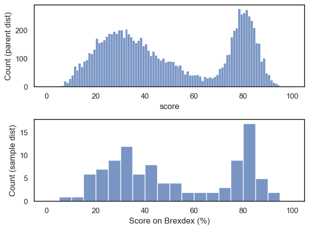
Hopefully we can see that the distribution within the sample resembles the shape of the distribution in the national sample, with two peaks, although somewhat noisier
Let’s draw a few more random samples, each time of size 100, to check that this relationship is reliable:
plt.figure(figsize = (12,9))

for i in range(1,13):
    sample = UKBrexdex.sample(n=100, replace=False)
    plt.subplot(3,4,i)
    sns.histplot(sample.score, bins=range(0,101,5), kde=True) # use wider bins for the sample as there are fewer datapoints   A
plt.tight_layout()
plt.show()
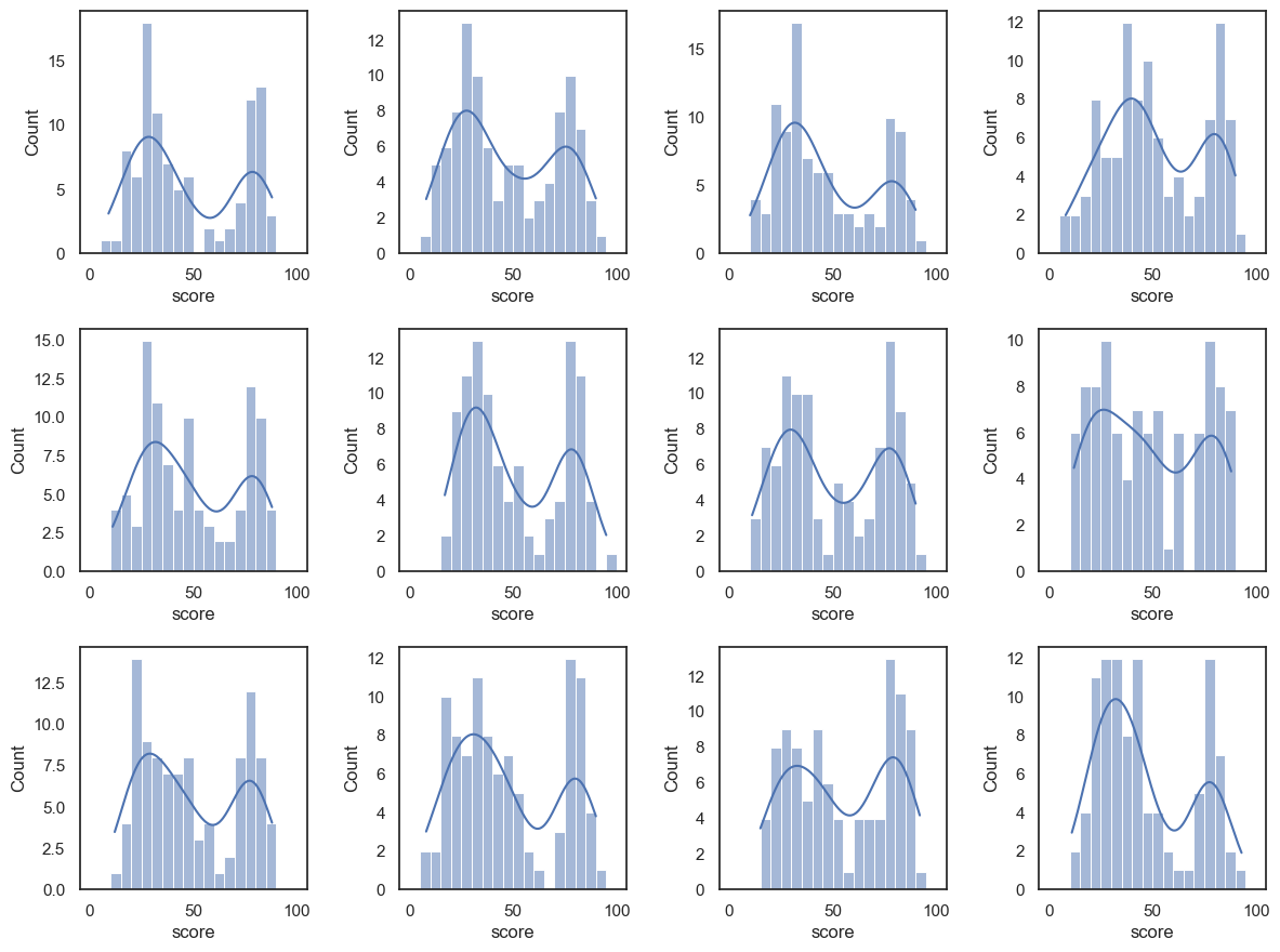
Notice that we always manage to reproduce the bimodal shape, albeit with random variability.
The distribution within each sample resembles the parent distribution from which it is drawn, ie the UK national sample.
This is true even if the sample size gets small. Let’s try the same thing for samples of size \(n=20\)
plt.figure(figsize = (12,9))

for i in range(1,13):
    sample = UKBrexdex.sample(n=20, replace=False)
    plt.subplot(3,4,i)
    sns.histplot(sample.score, bins=range(0,101,5), kde=True) # use wider bins for the sample as there are fewer datapoints   A
    plt.xlim([0,100])
    plt.ylim([0, 5])
plt.tight_layout()
plt.show()
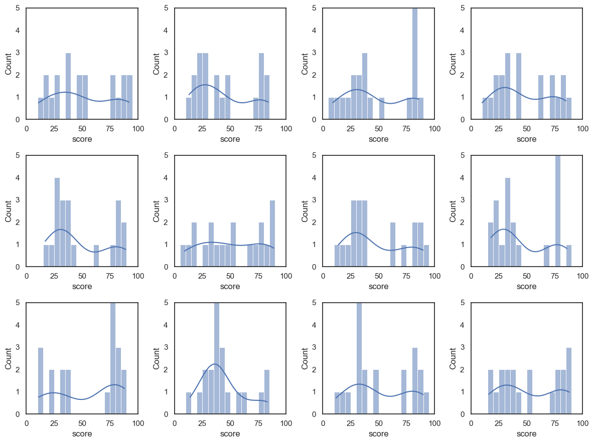
You can see two things:
The shape of the sample distribution matches the shape of the parent distribution even for small samples
The match is less reliable for small samples
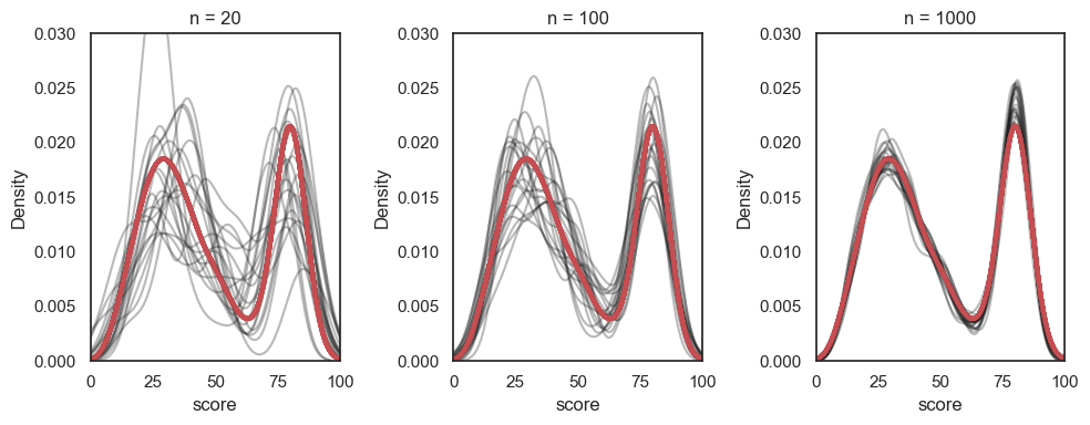
Overlaying the KDEs from many samples of size \(n=1000\), \(n=100\) and \(n=20\) shows how the samples become less variable as \(n\) increases:
# You wouldn't be expected to produce this code yourself!
samplesize=[20,100,1000]
plt.figure(figsize=[10,4])

for j in range(len(samplesize)):
    plt.subplot(1,3,j+1)
    for i in range(20):
        sample = UKBrexdex.sample(n=samplesize[j],replace=False)
        sns.kdeplot(sample.score, color='k', alpha=0.3, bw_adjust=0.5) # note I manually changed the smoothing of the KDE plot - this is a bit tangential to the point of the exercise though so don't get distracted by it
        plt.xlim([0,100])
        plt.ylim([0, 0.03])
        sns.kdeplot(UKBrexdex['score'],color='r', linewidth = 3)
        plt.title('n = ' + str(samplesize[j]))

plt.tight_layout()
plt.show()