4.6. Power analysis by simulation#
We can think of the hypothesis-testing framework as a 2×2 grid, contrasting reality (what is actually true) with our conclusions (what we decide based on the data and statistical test).

In general, null hypothesis testing focuses on one assumed state of reality: we assume the null hypothesis \(\mathcal{H}_0\) is true and ask how likely our observed result would be under that assumption.
In contrast, power analysis focuses on the other possible state of reality: we assume the alternative hypothesis \(\mathcal{H}_a\) is true and ask how likely we are to detect the effect.
In this notebook, using an example based on correlation, we illustrate these two hypothetical states of the world by generating data from two different populations:
a null population, in which \(\mathcal{H}_0\) is true; and
a correlated population, in which \(\mathcal{H}_a\) is true.
We will work with correlation (Pearson’s \(r\)) here, although later we will see that exactly the same approach can be applied to differences of means using the \(t\)-test.
We can then:
work out the proportion of false positives we obtain when \(\mathcal{H}_0\) is true, by repeatedly drawing samples from the null population;
work out the proportion of false negatives we obtain when \(\mathcal{H}_a\) is true, by repeatedly drawing samples from the correlated population.
The complement of the false-negative rate gives us the power of the analysis.
Although we will later see that power analyses can be carried out using built-in functions in the Python library statsmodels, it is helpful to first understand the simulation-based approach. This provides clear intuition about what a power analysis actually is and how it relates to hypothesis testing.
4.6.1. Video#
Here is a video summarising the conceptual content of this page:
%%HTML
<iframe width="560" height="315" src="https://www.youtube.com/embed/OnUrahxR_CI?si=6Hdw3NLGgYgOIfuz" title="YouTube video player" frameborder="0" allow="accelerometer; autoplay; clipboard-write; encrypted-media; gyroscope; picture-in-picture; web-share" referrerpolicy="strict-origin-when-cross-origin" allowfullscreen></iframe>
Set up Python libraries#
As usual, run the code cell below to import the relevant Python libraries
# Set-up Python libraries - you need to run this but you don't need to change it
import numpy as np
import matplotlib.pyplot as plt
import scipy.stats as stats
import pandas as pd
import seaborn as sns
sns.set_theme(style='white')
import statsmodels.api as sm
import statsmodels.formula.api as smf
import warnings
warnings.simplefilter('ignore', category=FutureWarning)
4.7. Example#
I collect data on end-of-year exam scores in Maths and French for 50 high school students. I then calculate the correlation coefficient, Pearson’s \(r\), between Maths and French scores across my sample of \(n = 50\) participants.
\(\mathcal{H}_0\): Under the null hypothesis, there is no correlation between Maths scores and French scores.
\(\mathcal{H}_a\): Under the alternative hypothesis, there is a positive correlation between Maths scores and French scores.
This is a one-tailed test with significance level \(\alpha = 0.05\).
I observe a correlation of \(r = 0.25\). This value of \(r\) is my effect size.
Can I trust this result?
4.7.1. Eyeballing the data#
What does a correlation of \(r = 0.25\) look like when we have 50 data points?
Below are some example datasets that all have a correlation of \(r = 0.25\):
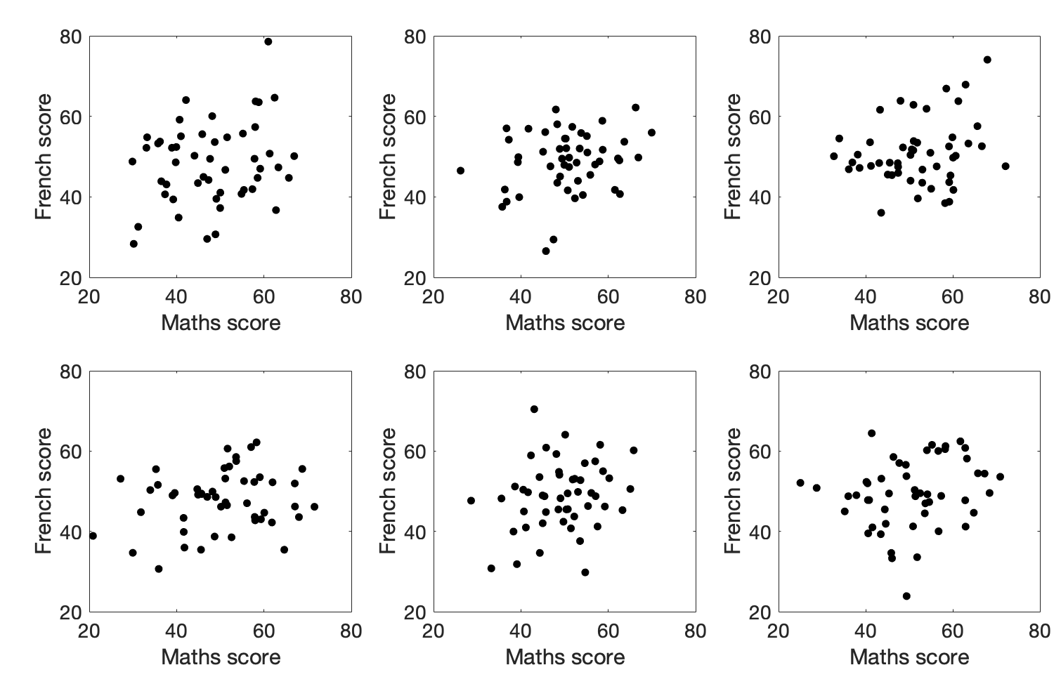
Would you trust those correlations?
4.7.2. Simulating the population#
A false positive (Type I error) occurs when we obtain a statistically significant correlation in a sample, even though there is no true correlation in the population.
A false negative (Type II error) occurs when we fail to obtain a statistically significant correlation in a sample, even though there is a true correlation in the population.
To understand the relationship between these two types of error, we will generate two hypothetical “populations” of data:
a null population, in which the true correlation is \(\rho = 0\);
a correlated population, in which the true correlation is \(\rho = 0.25\).
Note: the symbol \(\rho\) (rho) denotes the true correlation in the population. It is the population analogue of the sample correlation coefficient \(r\). If \(\rho = 0.25\), then samples drawn from the population will have \(r \approx 0.25\), but the exact value of \(r\) will vary from sample to sample due to random sampling.
Each population dataset will contain 25,000 paired observations (two columns with 25,000 rows), with a correlation of either 0 (null population) or 0.25 (correlated population).
By repeatedly drawing random samples of size \(n = 50\) from each population, we can ask:
how often do we find a statistically significant correlation when sampling from the null population (false positives, Type I errors)?
how often do we fail to find a statistically significant correlation when sampling from the correlated population (false negatives, Type II errors)?
You will not be asked to replicate this code, so do not worry about the Python details.
4.7.3. Null population#
# Code to generate the population with zero correlation - don't worry about understanding this bit

rho=0 # the desired correlation

# desired mean and sd of variables in columns 0 and 1
m0=50
m1=50
s0=8
s1=5

c=[[1,rho],[rho,1]] # the correlation matrix that we want in the simulated dataset

# make two columns of numbers with the desired correlation (mean of each column is zero, sd is 1)
tmp=np.random.multivariate_normal([0,0],c,size=25000)

# scale the variables to get correct mean and sd
tmp[:,0]=(tmp[:,0]*s0)+m0
tmp[:,1]=(tmp[:,1]*s1)+m1
pop_rZero=pd.DataFrame(tmp,columns=['Maths','French'])

# plot scatterplot
sns.scatterplot(data=pop_rZero,x='Maths',y='French',alpha=0.01)
plt.show()
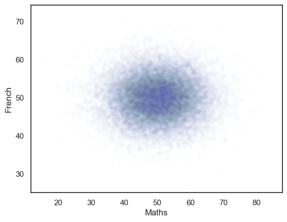
The generated dataset has two columns and 25,000 rows.
The correlation between the two columns should be close to the r value we set, ie zero.
The scatterplot definitely looks like there is no correlation!
# check that the actual correlation is in the 10000 simulated samples
pop_rZero.corr()
| Maths | French | |
|---|---|---|
| Maths | 1.000000 | 0.003178 |
| French | 0.003178 | 1.000000 |
Simulating false positives#
We can now work out how often we get a significant correlation (\(p<0.05\)) in samples (\(n=50\)) drawn from the null population, by drawing 10000 samples and getting the p value for each one using stats.pearsonr().pvalue.
The number of false positives will simply be the proportion of those obtained \(p\)-values that are below 5%.
nReps=10000
sampleSize=50
p = np.empty(nReps)

for i in range(nReps):
    sample = pop_rZero.sample(n=sampleSize) # sample 50 random rows from our null population
    p[i] = stats.pearsonr(sample['Maths'], sample['French'], alternative='greater').pvalue # correlate and get p-value
# How many of our 10000 samples had p<0.05?
np.mean(p<0.05)
np.float64(0.0551)
Hopefully the proportion of samples from the no-correlation distribution with p<0.05 is about…. 0.05.
4.7.4. Correlated population#
Now we generate a population with a true correlation of \(r=0.25\)
# Code to generate the population with a correlation of rho - don't worry about understanding this bit

rho=0.25 # the desired correlation

# desired mean and sd of variables in columns 0 and 1
m0=50
m1=0
s0=4.5
s1=1

c=[[1,rho],[rho,1]] # the correlation matrix that we want in the simulated dataset

# make two columns of numbers with the desired correlation (mean of each column is zero, sd is 1)
tmp=np.random.multivariate_normal([0,0],c,size=25000)

# scale the variables to get correct mean and sd
tmp[:,0]=(tmp[:,0]*s0)+m0
tmp[:,1]=(tmp[:,1]*s1)+m1
pop_rNonZero=pd.DataFrame(tmp,columns=['Maths','French'])

# plot scatterplot
sns.scatterplot(data=pop_rNonZero,x='Maths',y='French',alpha=0.01)
plt.show()
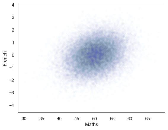
We can check the correlation in the full population of 25000 samples, hopefully this should be close to 0.25.
pop_rNonZero.corr()
| Maths | French | |
|---|---|---|
| Maths | 1.000000 | 0.252036 |
| French | 0.252036 | 1.000000 |
Simulating false negatives#
Power is the proportion of the time we find a significant effect, given than an effect is presentin the underlying population (or conversely one minus the proportion of the time we fail to detect and effect, given one is present).
We can investigate power (false negatives) in our correlation example using the same simulation approach we used above for false positives, but using the correlated population.
The question for our power analysis is, for samples of size \(n=50\), what proportion of the time will I obtain a significant correlation (reject the null)?
To answer that question I am going to draw samples of size \(n=50\) from the population which actually has \(\rho\)=0.25 and obtain the sample correlation for each of those samples and its \(p\)-value using stats.pearsonr().pvalue.
I can then ask in what proportion of simulated samples \(p<0.05\), ie in what proportion of the simulated samples we manage to reject the null.
nReps=1000
sampleSize=50
p = np.empty(nReps)

for i in range(nReps):
    sample = pop_rNonZero.sample(n=sampleSize) # grab 50 random rows from my correlated population
    p[i] = stats.pearsonr(sample['Maths'], sample['French'], alternative='greater').pvalue # correlate and get p-value

# How many of our 10000 samples had p<0.05?
np.mean(p<0.05)
np.float64(0.571)
So, in my simulation I manage to reject the null in about 40% of simulations (note the exact value you get will vary slightly each time you run the simulation). So my test has a power of 40%

Yes, that’s right. In a population where the true correlation between two variables (scores on Maths and French tests) is \(\rho=0.25\), for samples of size \(n=50\), I will fail to detect a significant correlation (ie, there is a false negative or Type II error) over half the time.
This would be true for any data with a true correlation of \(\rho=0.25\) and sample size of \(n=50\). \(n=50\) is really not enough to detect a weakish correlation.
Try changing \(n\) in the code block below to be smaller (eg \(n\)=25) or larger (\(n\)=150) and see what happens to the power.
Warning this takes a few seconds to run on a fastish computer; if you are working on a slow computer or Colab you may wish to skip it
nReps=1000
sampleSize=50
p = np.empty(nReps)

for i in range(nReps):
    sample = pop_rNonZero.sample(n=sampleSize)
    p[i] = stats.pearsonr(sample['Maths'], sample['French'], alternative='greater').pvalue

# How many of our 10000 samples had p<0.05?
np.mean(p<0.05)
np.float64(0.552)
4.7.5. Determining the required sample size#
We have just seen that a large sample size is needed to get good power for a weak correlation. How large, exactly?
We can loop over different sample sizes and plot how power increases as sample size increases:
Warning - if you run this code block it may take a couple of minutes, or longer if your computer is a bit slow. You don’t actually need to run it.
n=range(2,150,10)
power = np.empty(len(n))

for s in range(len(n)):
    nReps=1000
    p = np.empty(nReps)
    sampleSize=n[s]

    for i in range(nReps):
        sample = pop_rNonZero.sample(n=sampleSize)
        p[i] = stats.pearsonr(sample['Maths'], sample['French'], alternative='greater').pvalue

    power[s]=np.mean(p<0.05)

# plot the results
plt.plot(n,power,'k.-')
plt.plot([min(n),max(n)],[0.8,0.8],'r--') # reference line for 80% power
plt.xlabel('sample size')
plt.ylabel('power')
plt.show()
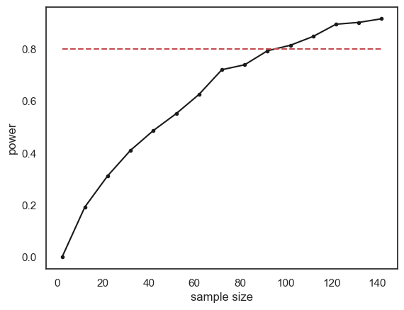
The relationship between sample size and power is slightly bumpy as we checked only 1000 simulated samples at each sample size. If you increased nReps to 10,000 the curve would look smoother (but the simulation would take a long time to run).
Conventionally a power of 80% (indicated by the red dashed line on the graph) is considered desirable (80% is a completely arbitrary value by the way).
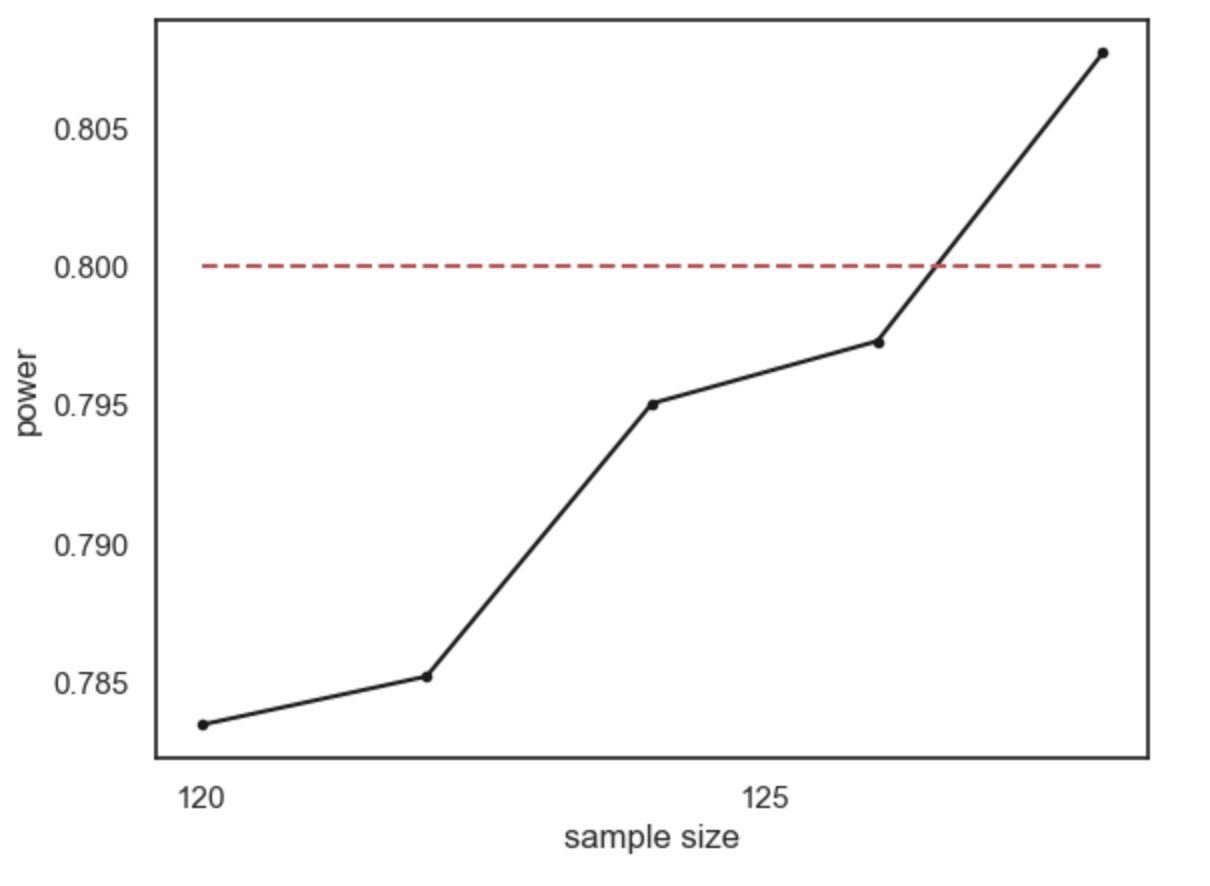
What sample size do we need to ge t power of 80%? It looks from the graph like you would need around n=120. Here are the results if we run a finer grained simulation in that range:
4.7.6. Recap#
Power is defined as the propotion of the time a significant effect is detected, given that there is an effect (of a certain size in the data)
Power depends on sample size; a larger sample gives a better chance to detect the effect (if there is one)
To reach a desirable level of power (say 80%) we need a certain sample size; this sample size depends on the effect size and \(\alpha\) value we are working with
The smaller the effect size, the larger the sample size neeed to detect it.
The more stringent the \(\alpha\) value, the larger the sample needed to detect an effect of a given size
To work out the required sample size, we did the following steps for different values of \(n\):
simulated data with the effect size we think is present in the population (\(\rho=0.25\))
drew many samples of size \(n\) and tested for a significant effect
worked out the power as the proportion of samples with a significant effect
The process of determining the required sample size to detect a certain effect with a certain power is called power analysis
4.7.7. Built in function for power#
Now you understand conceptually what power analysis is about, we can move on to running it using a built-in function.
There is a built in function in a package called statsmodels for doing power analysis.
In the next notebook we will see this for \(t\)-tests and correlations.